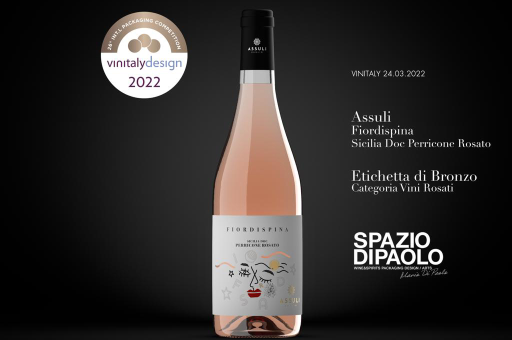
The packaging design of the new in the with Fiordispina Assuli pink wine obtained the Bronze Medal in the Rosé Wines category with its 2021 vintage marking its début in the category.
The award is assigned by an international jury of designers, art-directors and journalists chaired by Leonardo Sonnoli who proclaimed the distinctive packaging for better image – thus including bottle, closure, capsule, label, collar and other aesthetic features – in 13 categories. The recognition – established by Vinitaly and now in its 26th edition – arose from the desire to reward the relentless commitment of companies in the continuous improvement of their Visual Identity. Over 300 samples were entered and subjected to scrutiny by the commission of experts who identified and awarded the distinctive features of the new FIORDISPINA ’21 packaging – illustrated by Spazio di Paolo – which contributes to telling the story of a fresh and contemporary wine in every detail.
For the label, a strongly contemporary inspiration was chosen for the character in the famous chivalric poem Orlando Furioso that inspired it, with a unique packaging with a strong aesthetic impact. The label contains all the wealth of Ariosto’s figurative imagery: the deeds of Fiordispina, daughter of King Marsilio, define the deconstructed and contemporary visual grammar of the new image. The label features a white background in which the iconic elements of the visual imagery of chivalry, weapons, horses and courtesies stand out. Inspired by the culture of the original and Italian Furioso, narrated in a modern way, with a revitalized, playful, dynamic and fresh language. The name of the wine is the protagonist in the middle becoming one with the grape variety. The feminine traits marked by an ambiguous passion are found in the red lips and dreamy eyes that have their roots in the past to represent the new Sicilian wine dimension. A completely exclusive and unprecedented identity, youthful yet heavily attributable to heritage. Furthermore, for the first time the ‘cut’ becomes an integral part of the identity, that gesture recalling Fontana who revolutionized contemporary art. The engraved shapes bring out the product and define an assertive and “timeless” trait. A celebration of the island: a tribute to history, to elegant culture, to intense colours. And also to evolution.
Each character is represented with an illustration created ad hoc. The back label, on the other hand, responds to the desire to inform the consumer about the organoleptic characteristics and the possession of organic certification.
In addition to the graphics, the bottle was chosen taking into consideration the shape and form with an eye to sustainability. The glass bottle shape chosen is borgognotta, wide at the base, with tapered shoulders offered in the ‘Light’ version with white glass. The latter is rightfully included in lightweighting, that is the direction taken to reduce weight by using lighter glass, which reduces the use of raw materials, emissions of nitrogen oxides and sulphur dioxide and costs related to transport. To complete the package, the capsule size will be revisited (shorter), giving the bottle a more modern appeal.
The fineness is also entrusted to the Fedrigoni – Ritrama® Luce WS Barrier,, FSC certified natural paper, sensitive to heat; to the finishing with Kurz hot foil and the addition of a thickened silk-screen varnish to accentuate the effect to the touch. The name Assuli is drawn with refinement in a warm and refined gold that stands out clearly on the label with the allure of tactile paper.
A result to which the personality and intuition of Mario di Paolo, an internationally renowned creative artist in the wine & spirits sector, contributed fundamentally. He is the most awarded designer in Italy: in more recent years he has won ten Pentawards trophies, also affirming himself in the 2021 edition with three projects that have won a silver and two bronzes. His creation, Spazio Di Paolo, is a studio specializing in the packaging design of wine and spirits, today one of the most awarded in the world with a palmarès of over 200 of the most prestigious international packaging design awards.
The entire restyling is aimed at reaffirming the traditional forward propensity of the Assuli winery, in a renewed contemporaneity, synonymous with solidity, optimism, presence and attention to quality.
“With Fiordspina, Assuli upholds its desire to aim only in promoting autochthonous grapes. We believe that Perricone can be the symbolic vine in the rebirth of Trapani viticulture, distinguishing itself from the other red berried grapes for elegance and depth. With the pink wine we want to communicate pleasantness, cheerfulness and freshness, messages that for us are not in contrast with the severe care we take right from the vine. A wine for everyone is not a wine to be underestimated” said Roberto Caruso, President of Assuli “I believe that this new wine together with its unmistakable packaging and its lively and elegant colour well represent the desire to never stop in continuing to experiment, both characteristics of Assuli”, he added.
🔗 https://www.assuli.it/en/prodotti/fiordispina-en/embed/
Download the Press release


